Showing posts with label Advertising. Show all posts

Tuesday, June 4, 2019

ONE PHOTOGRAPHER’S FAVORITE HOTEL FOR WEDDINGS: RITZ CARLTON


The Ritz Carlton in Half Moon Bay, California is still my favorite hotel for weddings. Part of it is being located on the cliffs overlooking the gorgeous California coastline with beach access. But, it’s not just its location that makes this hotel so nice; it’s the style and service they provide the bride and groom that always impressed me. They take care of and look out for their clients by qualifying the vendors that provide wedding services at the hotel. As preferred vendors we were required to attend their orientation class and agree to the Hotel’s rules of etiquette. There is nothing onerous about it they just expect the wedding vendors to be professionals. That means that they have insurance (1-million dollars liability) and that they dress professionally and respect the facilities. These are things we always did at all of our wedding locations, rules or not. As full time professional photographers we wanted to return to all of the great locations that our clients choose for their events and be welcomed by the management and staff; that’s just good business practice. 

Some favorite images….
f4.5 @ 1/1150 sec., ISO 400; Lens @ 112mm
The Wedding party and family flew in from Texas and checked into the hotel a week before the wedding so we had the opportunity to do some bridals early in a relaxed and un-rushed environment three days before the wedding.  This enabled me to pick the time and location for her bridals. We did this image one hour before sunset for this nice directional light. The only thing missing here was her bouquet so we dug up a rose for her to hold…

 f4.0 @ 1/800 sec., ISO 400; Lens @ 80mm
Then we went inside the hotel…
f4.0 @ 1/30 sec., ISO 400; Lens @ 50mm
She wanted some high fashion inside the Ritz and changed into her “guest clothes”.

The wedding day….
f2.8 @ 1/80 sec., ISO 400; Lens @ 50mm
Another reason we like doing Ritz Carlton weddings: the table settings and decor are a pleasure to photograph!

f2.8 @ 1/30 sec., Iso 400; Lens @ 27mm
Then there’s the view…
f6.7 @ 1/180 sec., ISO 400; Lens @ 24mm
This is the outdoor reception area which in this wedding was the spill-over area from their ballroom.

Meanwhile during the reception..
f5.6 @ 1/1250 sec., ISO 400; Lens @ 200mm
Taking the bride and groom down to the beach is a Must-Do when we go to this hotel! It’s only possible because the hotel provides golf carts to transport all of us down to the beach; it’s about a half mile on a steep paved path.  We usually spend about a half-hour on the beach getting some fun, romantic images and then it’s back to the reception for the rest of their events. 

Should you have questions…don’t hesitate to ask…’Til next week…

Author: Jerry W. Venz, PPA Master Photographer, Craftsman

Tuesday, April 2, 2019

USING BACKLIGHT AS THE KEY LIGHT OUTDOORS


Back in the day Kodak publications told amateur photographers to always have the sun at their back to avoid shadows and eliminate lens flare. It didn’t take me long to realize, even when I was an amateur photographer, that there was little drama in creating images with light that came from camera position; that’s just flat light. In fact it’s far better that the light striking your subject, wether in the studio or outdoors, comes from ANY direction other than from camera position. One of my very favorite types of directional light, especially for fine art, is using backlight as the key light when I’m outdoors.

TECH NOTE: 
The Key Light in photography is the dominate light striking the subject. When used properly the key light creates the three dimensionality and the drama that compels the viewer to SEE the artist’s intent in creating the image.

Time of day is the key for backlight….
f8.0 @ 1/250 sec., ISO 400; Lens @ 120mm
I usually go out about 2-hours before sunset to line up my subjects for backlight. I don’t wander around searching for subjects; these are already found subjects that I put on a list as future targets when the weather is good.

This image of sunflowers was taken in the middle of August in California, at 6pm. Flowers and fall colors leaves are naturals for this lighting. 

TECH NOTE:
With really bright flowers, (as with fall leaves), especially in a dark field, I use a spot meter on the leaves so I don’t clip the highlights.

This lighting can work with people too…
f5.0 @ 1/400 sec., ISO 800; Lens @ 200mm
This lighting is NOT for portraits! This type of lighting, as in this image, can create great pictorials of people doing things. 

This image, was done at 8pm, of people walking through an animal exhibition hall at the Idaho State Faire. The dust their feet kicked-up made for a terrific backlight image.

Now, back to some thorny blooms….
 f8.0 @ 1/800 sec., ISO 400; Lens @ 200mm
In this image, the backlight not only lights up the translucent blossoms, but the Rim Light on the cactus thorns is marvelous as well.

TECH NOTE:
It’s important to note that when doing extreme backlight, with the setting sun, that you must control lens flare. In spite of the fad to Create Lens Flare, which only makes professional photographers’ work look amateurish, I control flare to make my subjects look great. With lens flare you lose color density, contrast, and sharpness—things that photography does best!

Here’s how I control lens flare…

My set-up
It’s often not enough to use a large lens shade. So, I’ve added a black flag on a Mathews arm attached to my tripod. I always use this set-up when I’m doing portraits outside. I don’t really care if some photographers think they’re being artsy flaring out their nature photos but I think it’s photographic malpractice to allow flare in a portrait image all the time; it’s also bad business. It’s like improperly using soft focus.

Have a question? Don’t hesitate to ask…’Til next week…

Author: Jerry W. Venz, PPA Master Photographer, Craftsman

Tuesday, June 5, 2018

LIGHT PAINTING A STILL LIFE: A KNIFE IN THE STUDIO; PART 2


Last week’s blog was about how I light painted two black pistols. That was challenging, but after I narrowed the light’s angle it was surprisingly easy because that modification gave me the precision needed to realize the old studio lighting maxim: “put light where you want it and don’t put light where you don’t want it”!

In this studio light paining blog I picked something more difficult—a very reflective knife. It’s a polished, stainless steel, dive knife that I paired with a vintage, stainless steel, Casio diver’s watch. To complete the set-up and enhance the dive theme I added a bunch of sea shells and a piece of white coral. Yeah, it’s complicated and a bit busy and after messing with the composition of all these elements I decided that the knife should be the center of interest because of its size and the powerful color of its handle. I had intended to make the watch the center of interest until I saw that it didn’t have the impact to lead in this set.

Here’s the final edited image….
f16.0 @ 30 sec., ISO 125; Lens @ 200mm

How I got the shot:


Lighting: In Part 1 I told you that I had to make a snoot (made of Cinefoil) for my flashlight to reduce the beam size for more accurate placement of highlights on my subjects. Well, because my subjects here are smaller and with all those tiny sea shells needing precise lighting I reduced the size of my snoot’s opening to about pencil size.

Painting:  You may be asking, “How did he get the blade of that knife without reflections from the flashlight?” that was my intent from the start—I wanted it to look almost black because I wanted the inscription on that, chrome like, polished blade to really stand out. 

So, when painting I swept my flashlight over the top edges of my set pieces (especially on the knife’s handle) without creating any forward angle that would front light the blade. Then I swept the light from each side working on all those shells.

Eliminating blade reflection:  You’ve probably heard the term, “angle of incidence equals angle of reflectance”, this just means that if the angle of your light matches your angle of observation you will see a reflection.

Family of Angles:  This refers to the Angles of view from a light source that a reflective surface will direct light back into the lens. For a flat surface the family of angles are the same as the lens’ angle of view—but coming back toward the camera.

The Solution:  Change your angle of view (lens focal length) so that the cone of light misses the lens.  So, I used a longer focal length (200mm) from a greater distance to reduce the family of angles (the cone of light). Now that the light is outside the family of angels light will not reflect back into the lens, thus eliminating direct reflections.

And that give me my dark blade!

The Background:  With so many more elements to paint I used up my 30 seconds on my subjects, so I had to do a separate exposure for the background.

f16.0 @ 30 se.c, ISO 125; Lens @ 200mm
Note on Color:  One of the problems when painting with an LED flashlight is that the LED light quality (its color temperature) can vary wildly between manufacturers. This is called its CRI—Color Rendering Index—which ideally should be 100 or 5500°K, the color temperature of daylight. Most LED flashlights are not even close to a CRI of 100 (I often saw a very blue shift in color in my painted set-ups using cheap LED flashlights) and most sellers or manufacturers won’t even tell you in the specs anything about its CRI! When I did find some LED flashlights with color temperatures at 5500°K (CRI100) they were really expensive ($100 to $350) and there was little variety in configuration compared to the cheap LED lights—such as multi-LED wands and such.

My Solution for Color: I simply started doing a custom white balance for each LED light. You just light paint a grey card exactly the same as painting your subject (same exposure) and you’re done.

That’s it for this week.  On to something new for next week… “Til then…

If you would like to check out the video I did on Light Painting go to: https://www.youtube.com/watch?v=oPng2IwX6Zg&t=20s

Author: Jerry W. Venz, PPA Master Photographer, Craftsman
Training Site: http://www.LightAtTheEdge.com
Client Site: http://www.TheStorytellersUsa.com

Tuesday, March 13, 2018

OUTDOOR COMMERCIAL PHOTOGRAPHY AT NIGHT


If you’ve read my blogs before you know that I rarely use flash as a main or even as fill when I do photography outside. It just does not blend well with natural or even continuous artificial lights.   The great thing about our professional digital cameras is that we can use much higher ISO’s, with less noise, longer exposures, (on a tripod) and with the recovery possible using RAW files, it’s amazing what can be accomplished now without resorting to supplemental flash.

As an example the following commercial shoot I did outside about an hour after sunset was done with only the existing ambient and the continuous artificial lights at the location. I wanted those white Christmas lights on the truck to stand out; if I had used flash not only would those lights have all but disappeared, but the snow would have been way too bright.

Here’s the final image….

f6.3 @ 1/20 sec., ISO 800; Lens @ 45mm

The key to this image working was proper exposure of the highlights without too much under exposure of the darker areas. The most important highlight area was the large lighted Zamzows sign that was about 25 yards behind the truck. So, I exposed for that lighted sign and let the truck go a little underexposed. However, since upon reviewing the image on my camera I saw that I could read the lettering on the truck and I still had detail in the deep shadows I knew that I could recover all that underexposed area in post processing. 

Here is the original file….

Original Image
It’s remarkable what can be done just using Adobe Camera Raw to bring down highlights or recover shadow detail; ACR can recover 2-stops or more in a RAW file.

Here’s my ACR adjustments on this file:
  • Exposure + 1.10
  • Highlights -  94
  • Shadows + 55
  • Whites -  60
  • Blacks -  43
  • Contrast -  22
  • Clarity + 56
  • Vibrance + 8
After sharpening at: 67 I used Noise Reduction:
  • Luminance 50
  • Color 50
And finally I adjusted the white balance to remove blue from the snow and warm the scene a bit. Quick and easy…

Ask if you have questions…’Til next week…

Author:  Jerry W. Venz, PPA Master Photographer, Craftsman
Training site: http://www.LightAtTheEdge.com
Client site: http://www.TheStorytellersUsa.com

Tuesday, June 20, 2017

JUNKYARD PHOTOGRAPHY AS ART

Photographers just love old, rusted, weathered things. I’m no different—I’ve always been drawn to old decaying artifacts wether they be man made—like cemeteries, junkyards, ghost towns—or natural made like the slowly eroding sand stone structures in Canyon Lands and Arches National Park or the ancient bristlecones or Jeffery Pine trees in the west or the ultimate in weathered erosion the Grand Canyon.  These things draw us like moths to a flame!

Unlike a lot of photographers though, I am extremely picky about the quality of light that I use to photography my subjects. And, that quality comes down to one thing—the time of day, because I use “The Best Light Money Can’t Buy—Natural Light!” 

I DID THIS IMAGE 1 HOUR BEFORE SUNSET…

f8.0 @ 1/320 sec., ISO 400
I used very directional, direct sunlight, to pick up detail and texture and create shadows to show three-dimensionality. I love this scene because of the primary color contrast of these tractor differentials. I moved my camera position to the right to Layer the red one against the blue one.

THIS NEXT IMAGE WAS DONE 30 MINUTES BEFORE SUNSET…
f11.0 @ 1/160 sec., ISO 400
This image illustrates that besides time of day it’s equally important that you move your camera position relative to the subject to create the most dramatic lighting. I used a skimming back light here, it really picks-up the texture in this rusted tractor. If I can’t get in a position to get this dramatic light or there is NO Directional Light On My Subject—I Move On.

THIS IMAGE WAS TAKEN 20 MINUTES BEFORE SUNSET…
f16.0 @ 1/50 sec., ISO 400
This scene was one that I had earlier walked on by—with a mental note to revisit because it was in direct flat light at the time. I don’t waste my time using flat light with great subjects like these.  

Watching the sun’s direction of travel I knew this scene would develop nice texture close to sunset.

THIS IMAGE WAS TAKEN ABOUT 5 MINUTES BEFORE SUNSET…
f11.0 @ 1/80 sec., ISO 400
This was one of the last images I did on this location. The sun’s last rays were peaking between a large combine and stacks of tires creating a spot light effect on the “skin” of this small tractor.

For me this is what photography is all about—using dramatic light to create shape and texture. If I don’t have great light I don’t even take my camera out of it’s bag when I am in total control of the decision.

As always, should you have questions or comments leave them in the comments section.  ’Til next week…

Author:  Jerry W. Venz, PPA Master Photographer, Craftsman
Training site:  http://www.LightAtTheEdge.com
Client site: http://www.TheStorytellersUsa.com

Tuesday, March 21, 2017

STUDIO MOTORCYCLE PHOTOGRAPHY ON A BUDGET

Studio photography of motorcycles is complex and time consuming. That’s why so many photographers would rather go on location outside and use natural light—I know I prefer that alternative! But, on occasion, I really like getting in the studio to do this kind of very technical, often problem solving, photography. I think the reason many of today’s photographers do much of their photography outside is that they don’t want to invest in a studio lighting kit, backgrounds, and all the many studio support tools needed to build a studio.  Of course, then, they have to learn how to use all this equipment! That’s probably the biggest sticking point today.

What I’m going to share in this blog is how I did motorcycle studio photography back before digital (on film! ) and on a budget before I had the multiple sets of studio lights I have today.

So, flashing back to 1994….

f11.0 @ 1/250sec., ISO 100; lens: 65mm
This image was taken with my Mama RB-67 Pro-S on Kodak LPP, Lumiere 100, slide film in the 6x7cm format.  The low budget part was lighting my set with just Two Flash Heads on a Norman 500 w/s pack and just using reflectors as fill. That’s it, I didn’t own any more studio gear back then!  And, because of the then high tech., not so instant, image preview method, called Polaroid, I can show you my studio set up…


The Polaroid back on my RB-67 is what made studio photography possible before digital. 

Note:  This only applied to Technical studio work. We never “pulled Polaroids” when doing studio portraits of people—2-minutes was way too long to wait for the Polaroid to develop!

As you can see I used two relatively small soft boxes, at the ceiling, mounted on either side of the garrage door opener (I had a garage studio back then too…) That ruled-out using one large soft box, as is customary today, which was fine since I didn’t own anything else!

Now, the key to make this lighting set-up work was pointing both my main lights not directly at the motorcycle—but at my reflectors. I have the lights just skimming the top edges of the bike. Usually this meant my lights were angled at about 45 degrees towards the camera.  This meant I needed to flag my lens to prevent flare from my lights.

The only change I made from the Polaroid in my studio set-up was replacing the white drapes, on either side of the set, with black drapes to control bounce.  This next image was of MY baby…


 f11.0 @ 1/125 sec., ISO 100
This image of my favorite all time bike the Kawasaki Ninja 900 (1984) was done on Kodak, EPZ, Ektachrome, 100X Pro using my Mama, 645 format, camera.  The studio lighting was the same in this image. The most critical part here was getting my reflectors angled to reflect the lighting onto the front surface (the wheels, disk brakes and engine) of the bike.  Hooray for Polaroids! The only thing that would have improved this image would have been edging the tires with talcum powder to create separation highlights, but I didn’t learn that trick until many years later.  Another little trick I have learned along the way doing commercial photography is to dull shiny surfaces with hair spray.

So, that’s how we did it on a budget and before digital…

’Til next week…have questions don’t hesitate to ask.

Author:  Jerry W. Venz, PPA Master Photographer, Craftsman
Training site:  http://www.LightAtTheEdge.com
Client site: http://www.TheStorytellersUsa.com

Tuesday, August 23, 2016

PHOTOGRAPHY FOR A MAGAZINE COVER

Idaho Humane Society Paw Prints Magazine

Every year we — The Storytellersusa.com — donate portrait photography gift certificates to about 30 charitable organizations for their silent/live auctions.  It’s our way of giving back and being introduced to new potential clients—a definite win-win!

One of those charitable events last year was the Idaho Humane Society’s 25th Annual Lawn Party. In that event we donated to their silent auction and their live auction. The live auction was a chance for bidders to have their pets photographed for the cover of Paw Prints Magazine—a very popular live auction item that regularly goes for thousands of dollars!

So, a year later the editor of Paw Prints Magazine calls us with contact information of the family that won one of our live auction cover sessions.  When I called to schedule the photo session of their dog I suggested that we expand the session to do portraits of their family, kids and dog—no extra charge—and they loved the idea. My vision for the cover was a portrait of the kids with the family dog—not just a portrait of the dog that the magazine usually does. Of course my vision for this cover image was far more challenging than just a picture of the dog! It all depended on the dog’s temperament…


f6.3 @ 1.250 sec., ISO 800; lens at 200mm
It turned out that I had no need to worry—their dog was a joy to work with and the kids had a great time too. 

On a technical note some amateur photographers may wonder why I used ISO 800 for a session that looked to have lots of light…

1)  ISO is a professional’s tool to get the shutter speed and f-stop we require. Of course you need a pro-grade camera that has very low noise to use the ISO’s I like; my starting point in outdoor photography is ISO 400 then 800 and when needed I go to 1000 or 1600.
2)  ISO 800 in this environment enabled me to bring my shutter speed to 1/250 sec., which is about the slowest shutter speed I’ll use when doing action of kids—and kids with a dog are always in action!
3)  The aperture I wanted— f6.3 — gave me enough depth of field in case the kids moved out of alignment.
4) And Lastly, by using my zoom lens at 200 mm the background still went nicely out of focus even at the relatively small aperture I was using to get the good depth-of-field.

Here’s one of the series of nice full figure images from their session…
f6.3 @ 1.250 sec., ISO 800
We also did the usual individual portrait of the dog, but we talked-up my idea for the cover with the editor and he said he would consider my idea when he saw what we had created.  We’ll see what he picks soon, but either way I’m very happy with the results; I captured the vision I had in my head—the ultimate goal in professional photography!

’Til next week…

Author:  Jerry W. Venz, PPA Master Photographer, Craftsman, Certified
Training site:  http://www.LightAtTheEdge.com
Client stie: http://www.TheStorytellersUsa.com

Tuesday, May 3, 2016

MIXED ARTIFICIAL LIGHTING SENIOR PORTRAIT

When doing high school senior portraits it’s our job to tell their story in a way that is appropriate for their world.  If you’ve read this blog before then you know that it’s mostly about using natural light in outside portrait environments.  However, when we dive into the world of high-tech where everything is unnatural our lighting must reflect that environment.

So, when I approached this session of our son Alex, I looked at projects in his computer room to see if I could use any of them as, what we call in the filmmaking world, lighting practicals. For those of you unfamiliar with the world of home built computers and the art of “modding” PC cases there’s a whole culture out there where super computer geeks are not content with the power and speed of the computers most of us just buy off the shelf. They buy state of the art processors that they then “overclock” to the extent that extra cooling fans are needed—hence the need for larger custom cases.  Then, with all this extra real estate they started adding interior case lighting—cold cathode florescent light sticks and cooling fans with LEDs embedded in their blades—all in a variety of colors.  So, everyone could enjoy these light shows they cut openings in the sides of their computing towers and added plexiglass windows creating an art form that has grown ever more elaborate since this session was done back in 2003.

Therefore, it was a natural to use Alex’s own custom built tower not only as a prop, but one of the light sources for his portrait!

f5.6 @ 1/4 sec., ISO 1600
This portrait was done entirely by the light from Alex’s various computers and monitors that I placed around him. I really liked that blue glow cast on his face from the cold cathode florescent lights in the tower, but I wanted a more natural, warm, light on the other side of his face. So, I placed his large iMac monitor at camera left.

How do you get his nice natural light look from your iMac monitor you ask? Easy you just go into system preferences—> display and in calibrator assistant hit continue to go to “Select a target white point” and select D65 (midday sunlight). This give you proper color now for that dramatic color difference on each side of his face. Here’s the setup…

Set-up
The colors are great, but the overall light levels were pretty low as you can see by my settings; even at 1/4 sec., I had to use ISO 1600 to get f5.6 for an adequate depth of field.

I really like the cropped final version with Alex holding his optical mouse inverted pointing the LED at the camera. I also wanted something more so, we turned the iMac behind him on for that Apple screen saver image amid the faint green glow in the background.

Should you have any questions don’t hesitate to ask…’Til next week…

Author: Jerry W. Venz, PPA Master Photographer, Craftsman, Certified
Training site: http://www.LightAtTheEdge.com

Tuesday, March 1, 2016

STORYTELLING COMMERCIAL PHOTOGRAPHY

Having told the stories of hundreds of brides and grooms these past 25 years it’s obvious why we renamed our studio The Storytellers ( http://www.TheStorytellersUSA.com )after we started our new studio here in Meridian Idaho. Our name now matches what we’ve always done!


An example of our storytelling technique was used in this commission to photographically tell the story of a winery by tagging along on one of their public wine tasting tours.  My goal when showcasing another business is to highlight the features that set them apart—the unique aspect that the public will experience with that company. This is why I always do some close-up images, besides the usual bigger views, because the character of a company can be seen in the details.

f3.2 @ 1/250 sec., ISO 400
This image, done during the outside wine tasting, was to show the company logo (a must do!) in an artistic way.


With a winery you must get out in the vineyards and if  you can juxtapose them with one of their buildings so much the better! And, if you can include anything historical—this building had the date May 1, 1923 — better still.


In wineries planting dates are significant, so I had to get that image.


Showing people having a good time on the tasting/tour is always good.


Next our tour guide brought the group inside to the production area for the educational part of the tour.


There he pulled some wine directly from a barrel for some more wine tasting.


Then last stop on the tour is their public wine tasting room.  The limo out front didn’t hurt in this image either!


The unique handles on the tasting room’s doors—remember those details!


Showing off the ambience inside the tasting room.


I wrapped showing the outside ambiance at the winery as well.  These ten images are only a sample of the 140-image slideshow I delivered to the winery.

The entire job was done either by natural light or, when we went inside, by the existing, artificial, continuous lighting—made possible by ISO shifting from 400 outside to 3200 inside.

I did not want to use flash inside because flashed images do not intercut well with natural light images in a slide show—the light from flash looks too harsh. It also makes it easier to blend images from a creative perspective for advertising purposes.

Just one more reason why I love our digital capabilities.

As usual, should you have questions don’t hesitate to ask.

Author: Jerry W. Venz, PPA Master Photographer, Craftsman, Certified
Training site:  http://www.LightAtTheEdge.com

Tuesday, February 9, 2016

WINE BY NATUAL LIGHT

When I was approached by this winery to do some advertising photography and heard what they thought they wanted—the usual sterile, cliche, studio style all their competitors were doing—I set about to change their minds.  If you’ve seen this blog before you already know that my preference is to use natural light in my photography when appropriate—which is most of the time!  In this case I felt natural light was the only way to do such an organic product.  I told them that I wanted to reconnect that bottle of wine to the vineyard—that sold them!

Then it was off to their vineyards in the Santa Cruz Mountains—a short drive from where our studio was, at the time, in downtown Saratoga, California. I made arrangements to meet with their management on a clear evening at 5:30pm.  Since this was in August I wanted to be in the vineyard doing photography by 6:30pm, at the earliest, to avoid any direct sunlight on my subject-getting that nice late, soft, light towards sunset.  After I rummaged through one of their ware houses scoring a nice old, wooden crate we headed out to the vineyard with the bottles they wanted photographed.

Lighting on the location:

Placement of the subject is everything when using natural light outdoors, no matter what your subject is.  In this situation I started walking down the vineyard’s rows that were backlit, (so I’m facing West) looking for some nice bunches of grapes at the height of my wooden crate. Remember what I said earlier—I don’t want ANY direct sunlight on my subjects.  Why?  We need to control the dynamic range of the scene.  Direct sunlight would blow-out the white labels on the wine bottles when we got the grapes and leaves properly exposed. 

Now, my main light is the clear blue sky above and behind me (“the sky is my soft box”).

 f9.5 @ 1/20 sec., ISO 400, Lens @ 70mm
This was the final image.  You can see by looking at the tops of the bottles where by light source is—nice soft sky light.

 f6.7 @ 1/20 sec., ISO 400
We also did a single setup of the different wine variety showing an entire bottle.

f8.0 @ 1/60 sec., ISO 400
On my first visit to talk with the owners about this job I did a quick scout of the location. I did this image for a color/detail insert. It was in the morning so there was a lot of backlight for the grape bunch I chose.

f9.5 @ 1/160 sec., ISO 400
As I was leaving I got this nice scene of a portion of their vineyards. I really like the series of rolling hills in rim-light. I always do extra images like this on a job—I can’t help it when I get inspired I just keep shooting while the light is good! On the business side this is really good.  You want to over-deliver when it comes to images—surprise them with views they had not thought of. That’s how you can really impress the client—then they buy more!

As usual, should you have any questions or comments leave them below and I’ll get back to you.
’Til next week.

Author:  Jerry W. Venz, PPA Master Photographer, Craftsman, Certified
Training site:  http://www.LightAtTheEdge.com

Tuesday, February 2, 2016

PHOTOGRAPHY OF GLASS ART

Without photography most people would never be aware of the art being produced by traditional artists in the world.  So, when an artist commissions me to photographically showcase his work I take the task very seriously and do my best to visually describe the art in its “best light”.

Chris, a local artist, came to the studio with some of his glass art saying he needed really good photos of his art to enter into the biennial, juried kiln-glass, competition sponsored by Bullseye Glass. This is an international competition and exhibition for emerging artists in kiln formed glass.  They must enter photographs of their art because the shipping and receiving (with breakage and liability) of such unique delicate, pieces is out of the question.

This first piece is a shallow bowl and with most of Chris’ art pieces, that were translucent, the challenge was showing the translucent color and lighting the front surface with balanced lighting.
f18.0 @ 1/200 sec., ISO 200 Lens @ 70mm
The set-up is your typical table top with a small background support and lots of black velvet.  The key with his art was strong backlight (sometimes two) and a snooted “flying” spot (on a boom arm) to skim the artwork’s front surface.  Here’s the basic set-up…


The piece you see on the table Chris titled “The Blanket” and that’s what it looks like—a petrified woven blanket of glass. It’s thick and dense so I brought in two backlights—one hitting the blanket’s front edge to illustrate that thickness. To illustrate the blanket’s lumpy texture, I brought the snooted spot to the back edge of the blanket to skim the length of its front surface.

Here’s what that did…

f22.0 @ 1@200 sec., ISO 200, lens at 50mm
Next, I placed the “blanket” flat on the top of my flash head, with the small reflector, and moved the snooted spot low skimming from the top (long side) of the piece.

f20.0 @ 1/200 sec., ISO 200, lens at 50mm
The image above is the one that did it for Chris. That image made Chris one of the 32 finalists in the competition out of hundreds of entries. Then all the finalists’ art work went on a national tour followed by an exhibition at the Bellevue Arts Museum in Washington State.

I told Chris, “You know now you’ve got to display this piece the way I lit it for it to show well!” Chris said, “Yeah, I know….” and then he gave me his huge smile and shook my hand and thanked me for my help putting him on the artistic map!  That was back in 2012 and the reason I’m doing this blog is that Chris called me this week saying he wants me to photograph his newest glass art for the upcoming Bullseye Glass competition next month.

Sounds like fun! I love this kind of challenge…

’Til next week…as always, if you have a comment or questions send them my way…

Author: Jerry W. Venz, PPA Master Photographer, Craftsman, Certified
Training site:  http://www.LightAtTheEdge.com

Tuesday, January 26, 2016

PRODUCT PHOTOGRAPHY ON LOCATION

Product photography on location, particularly using a natural setting, is very challenging compared to the studio.  In the studio we have hundreds of tools that enable us to support and manage a product not to mention a vast array of lighting options, modifiers and shapers that we rely on to confidently create great images. Most of these tools we must leave behind when we are tasked with creating images of products in a truly unique natural environment. 

When we were approached to photograph a new line of hair care products I suggested the beach as a location, but not just any beach, a special beach I had been holding in my locations list for small products just like this!  So, off we went to this marvelous little California beach arriving there about an hour and a half before sunset on a beautiful August day.

Our client had given us 25 products to photography and we quickly learned that just getting three of these bottles placed on these crumbling rocky niches any where near straight, level or vertical was a real challenge!

Here, Kathi my lovely wife, assistant and product wrangler, sets-up a “simple” threesome. 

While she was occupied with that I did a simple single bottle in direct sun to get that nice color projected shadow on the rocks…


Easy, nothing to it with one subject! Well, I didn’t much like that first location that Kathi was working at, so we moved to a lower location that was more interesting.  Kathi quickly learned that to make these bottles vertically parallel she had to  make little piles of sand under the bottles to correct their tilt…


Here she’s moving little piles of the very abrasive sand (not good on her manicure for sure!) to make the corrective foundations.


f9.5 @1/125 sec., ISO 400


As you can see the lighting was changing fast as the sun went lower and we still had a big set-up to do.


On to the “Group Portrait”

I noticed a nice area on the cliff wall where we could place a lot of bottles and since the direct sunlight was no longer blasting this area we went to work placing bottles as fast as possible—the light was only going to last for maybe 30 minutes more.  We managed to place 18 bottles in a nice arrangement and they look pretty darn straight! 


Here is the final image…


Getting all those bottles to nest in those lumpy hive-like pockets in such a nice composition and getting them that straight and parallel to each other was tough.  All I can say is Kathi did an outstanding job—especially putting up with me as I critiqued her placements or informed her of any bottles that were tilted as I observed from camera position! 

Another good piece of information…pick your assistants well…they can make or break a job.

’Til next week…Don’t hesitate to ask questions and comments are also welcome…

Author:  Jerry W. Venz, PPA Master Photographer, Craftsman, Certified
Training Site:  http://www.LightAtTheEdge.com

Tuesday, January 5, 2016

BLENDING FLASH AND NATURAL LIGHT OUTDOORS

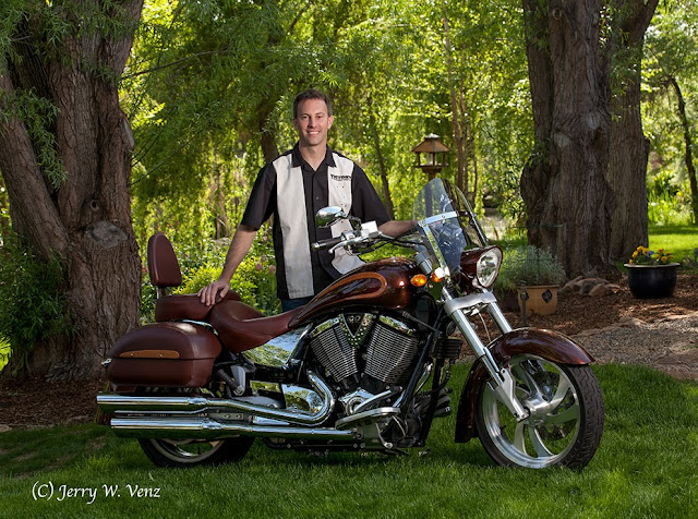
Natural light outdoors is my preferred source, especially when doing people. But when the main subject is an object, as in this commercial product shoot, with a lot of dark features mixed with very shinny parts, like this new retro-motorcycle, supplemental light is often required. To control the highlights in the chrome and polished alloys we set-up in the shade and started as late in the afternoon as we could to lower the difference in exposures between the natural light background and the shaded grass area.  This procedure effectively reduces the dynamic range of the scene.


f8.0 @ 1/125 sec., ISO 400, lens @ 85mm
This final image was a very simple lighting set-up.  I have a single 50” Halo, shoot-through, umbrella/soft box just out of frame on camera right. On camera left I placed a 42” sil-foil (silver) reflector.  That’s it—the rest is balancing the exposure between the background and the flash.

Here’s the before image done by natural light alone..

f8.0 @ 1/60 sec., ISO 400
It’s OK, but for a commercial image the light is too flat and dull—it needs more punch to bring the motorcycle “forward” to the viewer.

Key Point:  Natural light in portraits outside tends to “push” your subject into the environment.  While adding flash on subjects outside tends to “pull” the subjects out of the environment. 

Balancing the Light

The scene metered (incident light) f8.0 @ 1/60 sec., at ISO 400 by natural light. So, I used f8.0 as my aperture setting and metered my flash to be f8.0 at subject position.  Next, I adjusted my shutter speed to control the natural light level in the scene.

Key Point:  Just like studio photography, when doing photography outdoors with flash, the camera’s aperture controls the flash exposure and the shutter speed controls the ambient light.

For example: If you want the camera to see a lot of a room’s existing light you simply “drag the shutter” (set a slower shutter speed), along with your flash to brighten up the scene.  This is a common technique we used in wedding photography.

As you can see in the natural light image above the background is a little “hot”, so to bring it’s exposure down I bumped my shutter speed up (faster) and did test shots until it looked good on my camera’s screen.  Don’t you just LOVE our digital camera capabilities! I know I do!  In the old days, on film, we did this testing with Polaroid film backs on our medium format cameras—it was slow and time consuming.

I ended-up at 1/125th sec. (not much of an increase in shutter speed) because after a half-hour of testing the sun’s lower position had decreased the background light.

We brought the bike out into the sun to do detail shots of the bike’s custom paint and detail features in close-up.

Then my Photoshop Diva (my wife Kathi!) made this poster for our cross promotional advertising campaign.


Showcasing their custom paint artistry using our artistic talents was a fun collaboration. 

Hope you enjoyed…should you have questions don’t hesitate to ask…’Til next week…

Author:  Jerry W. Venz, PPA Master Photographer, Craftsman, Certified
Training site:  http://www.LightAtTheEdge.com