Tuesday, October 30, 2018

PROFESSIONAL STUDIO PHOTOGRAPHY—A BALLERINA


When doing photography of three-dimensional subjects, in the studio, it’s our job as professionals to use lighting that does not destroy that three-dimensionality. That means we must avoid Flat Lighting in most situations. One of the few exceptions I’ve encountered is in small product photography but, by and large, shadows should be created by our lighting set-up otherwise we just aren’t doing our job. I learned this the hard way and after 10-years of doing it like most other studio photographers did I discovered that I was simply using Too Many Lights! I was doing the usual Five or Six Light set-up and it just ended-up flashing all of the drama out of my images!  There were also Too Many Catch-Lights in my subjects eyes; it looked very unnatural. I learned that the offending culprit was using a studio Fill-Light; it flattened out my lighting ratio and created those secondary—ice pick like—catch lights in my subjects eyes. I, however, found that I couldn’t merely eliminate the fill light alone. It was demonstrated to me by Two Great photographers that I really respect, Will Crockett and Fred Hinegardner, that I also had to increase the Size of my Main Light significantly in order for the “wrapping effect” to eliminate the “need” of any type of fill.

So, I went from a typical 2 ft x 4 ft. Main Light to a 7-Foot OctoDome by Photoflex.

The results were stunning…
f13.0 @ 1/200 sec, ISO 200; Lens @ 70mm

There are only TWO Lights on my ballerina—the Main and the Hair Light; there are two lights on the background and that’s it.  I’m not even using a reflector.

Here’s my studio set-up for her…
Lighting Set-up
As you can see my large main light is placed to the side--just far enough so we maintain light in her far eye--creating a nice shadow on her face. The two background lights have grids and cine-foil shades to keep their light off my subject and ONLY on the background.

Here’s the only other Light in my set-up…

Hair Light
That 9”x24” strip light (also a soft box) does double duty here as the hair light and it puts highlights on her foot or hands when they’re above her head.

And Lighting from the opposite side…
Opposite side lighting
I’ve got my main light on Wheels so it’s easy to move to either side of the set.

Other advantages using a Large Soft Box:
  • Nice Large (round with mine) catchlights.
  • In close to subject wrapping effect with very soft shadows.
  • Pulled back (as shown) gives crisp details with pronounced shadows.
  • Covers large subjects or groups with ease.
Note on First Photo in the Blog:
The Lighting set-up in all these images is exactly the same. For the first photo I created a nice soft look in post by merely using Negative Clarity and Reduced Saturation.

That’s it for this week…Don’t hesitate to ask questions…

Author:  Jerry W. Venz, PPA Master Photographer, Craftsman
Training Site: http://www.LightAtTheEdge.com
Client Site: http://www.TheStorytellersUsa.com

Tuesday, October 23, 2018

FINE ART PHOTOGRAPHY: LEADING LINES IN COMPOSITION


In modern photography the fine art image is all about composition. I say that because with modern DSLRs it’s easy to achieve a good exposure and auto focus is so good that sharpness is rarely an issue. So, what’s left (what a camera can’t do) is composition of the scene. Unfortunately, too many professional photographers today seem to be ignorant of the most basic tenets of art. One example I see way too often is the composition killer of just putting the subject dead center in the frame! I don’t know if this is due to ignorance or laziness, but if you want people to look at your fine art images for more than two seconds you must learn the compositional concepts, that the master painters developed centuries ago, that create lasting interest in one’s art.

One powerful compositional tool we use to guide the viewer's eye is the Leading Line. The concept is simple; we look for something in the scene that will act as a pointer towards our chosen center-of-interest. 

Here’s my example of this technique….
f8.0 @ 1/640 sec., ISO 400; Lens @ 70mm
In this cropped image I have multiple leading lines, in that fence, taking the viewer’s eye to that nice foggy tree.  What’s important to notice is that I have that fence coming out of the Left Corner of the frame creating a nice diagonal across the frame. Remember I said that this compositional tool is powerful so you should be careful to not over use it. One way I see this happening a lot is when photographers put their leading lines (again!) dead center in the middle of the frame! One of the worst examples of this is placing railroad tracks up the middle of the frame (the horror!) Not to mention it is not legal to use the railroad tracks).

So here’s my original image before cropping…
Original Image
My original image has those leading lines, but the scene is weak and static because I’m showing the whole tree centered in the frame.  I rarely photograph whole trees anyway because for a good composition you have to reduce their size so much; I think trees get more interesting close-up.

The other things that bother me in my original image are those tree leaves hanging into the frame from above—a photographic convention that is just a distraction here, and the road on the right acting like a competing leading line.

Post Processing this image:
  1. Monochrome conversion: NIK’s Silver Efex Pro 2 using the Antique Plate preset modified to my taste.
  2. NIK’s, HDR Efex Pro2, single image tone mapping using Deep 2 preset (modified) with grain added.
  3. Cropped to enhance the leading lines.
So, before you click the shutter look and think about the scene you’ve framed up in your viewfinder because you can’t always crop your way into a better composition like we did with our medium and large format film cameras. So, unless you have a digital camera in the 50-80+ mega-pixel range it’s best to create the best composition at the point of capture.

’Til next week….ask if you have questions….

Author:  Jerry W. Venz, PPA Master Photographer, Craftsman
Training Site: http://www.LightAtTheEdge.com
Client Site: http://www.TheStorytellersUsa.com
Tuesday, October 16, 2018

OUTDOOR PORTRAITS AND TOO MUCH LIGHT? TRY SUBTRACTIVE LIGHTING!


It’s easy doing portraits outside near the “magic hour." Here in Idaho we often start up to two hours before sunset and, with proper subject placement, create wonderful natural light portraits with NO reflectors or supplemental flash (Yuck!).

I learned, over 30 years ago, from Leon Kennamer—the Master Photographer that developed subtractive lighting for portraits—that there’s no need for reflectors or supplemental flash if you know how to control natural light with Gobos (Black Flats or flags as we called them in film making). The basic premise being: when you have the light it’s silly, and unnatural looking, to add light! Adding light tends to just create flat light that deletes shadows and without any shadows you lose the three dimensionality in your subject(s).

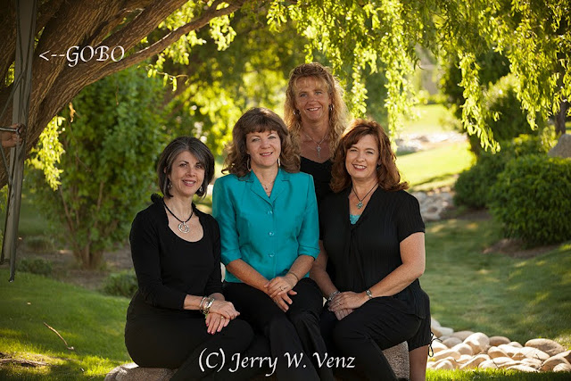
I’ll start with a worst case lighting scenario.  Here we have a nice little park with a couple of large weeping willow trees, but it’s 9AM and there’s intense light all around us. 
f6.3 @ 1/125 sec., ISO 400; Lens @ 142mm
  • The first step is to get them in the shade of that tree! I trimmed some of the tree’s hanging vines on the right leaving the vines on the left to help in the subtractive process.
  • Then we bring in our Gobo (a 42” Black Flat) to block as much light as we can from the left.
Here’s the scene without the Gobo….
No Gobo
As you can see this single Gobo is most effective on the people closest to it. The single Gobo is very effective for individual portraits where you can bring it in very close to the subject…

f4.5 @ 1/250 sec., Iso 400; Lens @ 185mm
Done at 9:11AM in the same spot as the group portrait you can see the natural looking, three dimensional, effect subtractive lighting creates.

NATURAL GOBOS:

My preferred method of subtractive lighting is to use Large Natural Gobos on locations I use regularly for group portraits. These natural Gobos can be a tree line, rocks, or large bushes to one side of the group.

The Key here is Subject Placement….

f6.3 @ 1/160 sec., ISO 400; Lens @ 105mm
Leon Kennamer taught that, “The Light is at the Edge of the Forrest ”. That means that you place your subject literally at the edge of the tree canopy, but still in the shade. That way we can get good Directional Light from a large patch of sky.

In the above portrait I’ve placed this group so that the tree line on Camera Left is my Gobo creating the Shadows on their faces while a large patch of blue sky on Camera Right is the Key Light.

This portrait was done 2-hours before sunset so that my backlit background is under control. Subtractive lighting is actually a very simple concept; its execution only requires that you be able to see the directional light and the shadows it creates when you have an effective GOBO.  

The concept here is fundamental in the traditional art world; Leonardo da Vince wrote…
The Artist who can make his subject appear to be in relivo (made to appear to have elevation, with depth and dimension) is he who should receive the greatest praise!

Go our and try it!  If you have questions don’t hesitate to ask…’Til next week.

Author: Jerry W. Venz, PPA Master Photographer, Craftsman
Training site: http://www.LightAtTheEdge.com
Client site: http://www.TheStorytellersUsa.com

Tuesday, October 9, 2018

FALL PHOTOGRAPHY TIPS FROM A PROFESSIONAL


First and foremost you’re NOT going to see any backed-off, wide-angle views, of a forrest of fall colors from me. I’ve always found those views pretty, but photographically boring. They’re what the amateurs do with their fixed lens point-n-shoot cameras—usually at the “scenic view” pull-out along side the road! 

I do what photography does best—narrow the view and reveal stunning detail. And, you do that with lenses leaning in the telephoto region of focal length.

That being said, lets move on to lighting.

Back-Lighting for intense detail…


f7.1 @ 1/800 sec., ISO 400; Lens @ 280mm
With this pair of small leaves 200mm was not enough so I installed my 1.4X extender on my 70-200mm f2.8 lens. The large lens hood with careful framing avoided flare (I HATE detail robbing flare!) in the intense backlight here.

Here I used backlighting for mood…

f7.1 @ 1/320 sec., ISO 400, Lens @ 98mm
With my lens at nearly 100mm I’m still only showing a part of this weeping willow tree; I rarely even photograph a whole single tree. In this image I wanted the juxtaposition of the hanging willow leaves over those interesting red bushes—that have lost their leaves.

Front Lighting can be Tricky….

f6.3 @ 1/800 sec., ISO 400; Lens @ 175mm

Direct Sun can easily ruin an image if you’re not very careful with your exposure. Those yellow leaves are prone to Clipping—blowing out your highlights—a loss of detail.

Two things made this image work:
  1. I did this at 5:04pm in November—the sun set at 5:20pm and I chose leaves that had Crossing Light from the left side. That directional light picked-up really nice detail.
  2. In Addition, I used my camera’s meter in Spot Mode—where I usually keep it—measuring the brightest surfaces of my subjects.
Or Front Lighting can be Easy…

f7.1 @ 1/160th sec., ISO 400; Lens @ 200mm
Top lighting here from an overcast sky is super easy to expose. It also creates nice soft colors. If the sun came out in this situation those wet leaves would have clipped like crazy. I cheated with this image and spritzed these leaves with my spray bottle mister until they dripped water—hey What can I say—it wasn’t raining when I needed wet leaves! Besides I don’t like doing photography in the rain.

Fall Colors in Flat Light…

 f8.0 @ 1/160th sec., ISO 800; Lens @ 150mm
This was done in full shade under this tree’s canopy. Since flat light can rob a scene of it’s contrast it’s important to pick a scene with lots of contrast. Here I had some great colors against that black tree trunk, which made these leaves glow with color. I did have to go to 800 ISO to capture this hand-held, but my Canon 5D MKII has no problem at that ISO.

I guess this proves that you can create great fall images in most lighting situations. You just have to pick subjects appropriate for the lighting and be careful with your exposures.

Well, ‘till next week…I’m here if you have questions….

Author:  Jerry W. Venz, PPA Master Photographer, Craftsman
Training Site: http://www.LightAtTheEdge.com
Client Site: http://www.TheStorytellersUsa.com

Tuesday, October 2, 2018

VARIATIONS ON A THEME; POST PROCESSING DIGITAL FILES


I’ve been revisiting my archives back to my early digital files, some as far back as 2000, when I got my first digital camera. What’s nice to see is that those old CD’s (Yes, CD’s!) can still be opened on our new computers and loaded into Photoshop!

I can open these old JPEGs in Camera Raw and do my favorite tweaks I do today with my new DSLR’s RAW files. After that I go to my favorite plug-ins for some artistic interpretations.

Here’s a finished artistic version of a file from 2003…


This image was form my second digital camera—the Fuji FinePix S-2 Pro, which produced jpegs at around 4.0 MB. Not much by todays standards, but we managed, with careful exposes, to produce some outstanding 30x40 images from our S2’s back then.

Black & White Processing Technique:

Step 1—NIK HDR Effects Pro 2 (Single Image Tone Mapping). Used Grannys Attic Preset with my modifications.

Step 2—NIK Silver Effects Pro 2—Used the Antique Plate 2 and modified it to my B&W taste.

Here’s the original file…


f13.0 @ 1/180 sec., ISO 400
This was an old hotel under renovation in Sacramento, California. I thought, with those ripped and tattered window shades, that it had the kind of creepy vibe that I could do something with.

Here’s the Color Interpretation….

I like this version mostly because of that red triangle in the second window (top left). It looks like a broken shard of glass.  I like the rust stains on the paint beneath the windows as well.

Color Processing Technique:

NIK HDR Effects Pro-2 (Single Image Tone Mapping).I used the Granny’s Attic Preset and tweaked it to my taste.

NOTE:  In addition to the obvious artistic changes to the original file a side benefit of processing an image in NIK’s HDR is that the size of the file is increased a lot.  With this image the original file was increased from 3.69MB to 6.06MBs.

However, I think that the Black and White rendition of this scene promotes the creepy vibe I imagined when I saw this building.  What do you guys think—the color or the Black and White?

’Til next week….

Author: Jerry W. Venz, PPA Master Photographer, Craftsman
Training Site:  http://www.LightAtTheEdge.com
Client Site: http://www.TheStorytellersUsa.com