Tuesday, December 11, 2018

DIRECTIONAL NATURAL LIGHT: PHOTOGRAPHY FOR TEXTURE


In photography, as in most of the visual arts, directional light is the essential ingredient in creating drama, depth, mood, mystery as well as three dimensionality and texture. And when I say directional light I mean light that strikes the subject from any direction other than from the viewers’ (or camera) position. In addition, when outside, using natural light I look for light that strikes my specific subject in a way that highlights its best features. That requires observation on my part to determine the best time of day for that subject.

One of my favorite things to photograph are old farm equipment and machinery—the older the better—and when these things are left outside in the elements they become especially attractive to me! So, when we visited some friends, who live in central California’s farm land, and I saw their old rusted farm machinery I was all over it!

Sitting under a tree was this large rusted, lumber saw…
f7.1 @ a/500 sec., ISO 400; Lens @ 47mm
The spotty light, filtering through the tree’s branches and leaves, from directly above skimmed the saw blade’s surface revealing its marvelous textures. I just waited for the most interesting pattern of shadows that accentuated the teeth of the blade. 

The other side of this saw was nice too….

f20.0 @ 1/80 sec., Iso 400; Lens @ 24mm
At the time the light filtering down through the tree was not adequate—the motor that powered the saw had no light on it so I went onto other subjects and came back 30 minutes later for the lighting you see in the above image. 

Going in close, using my lens at 24mm, with a very small aperture (f20.0) gave me the depth-of-field to show that cool old motor giving this image a nice foreground and relevant background feature.

This is what I was doing while waiting for good light on the saw…

f5.0 @ 1/250 sec., ISO 400; lens @ 45mm
Parked in an out building that was open on one side were some old tractors. This soft directional light is what I call Barn Light. The key here is that only open sky (without direct sunlight) is the source of light. This is one of my favorite types of light and it’s easy to work with. However, because the light level is lower a larger aperture, higher ISO and/or a tripod is sometimes needed.

On the other side of the old Ford tractor…

f10.0 @ 1/30 sec., ISO 800; Lens @ 15mm
I love the grease and grime coating the engine of this old Caterpillar tractor.  Since there was barely two-feet between each of these tractors and I wanted to capture this tractor’s treads I used my 15mm Fisheye lens (angle of view: 180 degrees) handheld at f10.0 and bumped my ISO to 800 for a useable shutter speed.

What I want to stress here is that you should not settle for just any kind of light. For dramatic, interesting, fine-art images you must wait for the best light. If it’s not directional you come back later when it is; That’s all there is to it!

That’s it for this week…have a question don’t hesitate to ask…’Til next week.

Author: Jerry W. Venz, PPA Master Photographer, Craftsman
Training site: http://www.LightAtTheEdge.com
Client site: http://www.TheStorytellersUsa.com

Tuesday, December 4, 2018

MY FIRST FINE ART IMAGES OF THE GHOST TOWN BODIE; Part 2


Waking up that frigid December morning, in 1978, in Bodie was really exciting. I was totally alone in one of the best ghost towns in America! I quickly set-up my single burner stove making some scrambled eggs and sausage. It was just as well that I could only cook one thing at a time because as soon as I removed my eggs from the pan onto a plate they were cold. I guess I was just lucky it was just super cold—being early December, at 8400 ft altitude, I was fortunate that I wasn’t snowed-in!

Fortified, I removed my camera—pre loaded with Kodachrome 64 film—from my insulated bags and noted they were cool to the touch, but not frigid. On a previous late November trip to the Grand Canyon one of my 35mm SLR camera’s shutter stopped working and the film advance levers were stiff because the extreme cold made the film less fixable. I’ve heard tell of other extreme cold weather photographer’s tales of the film getting so brittle that it would break inside their cameras. So, I figured that pre-loading my film in warm cameras plus the camera bag’s insulation would make my camera’s last longer outside in the deep cold.  Today I just have to wear my batteries so the cold does not drain them as fast.

In Part 1, I started with my main target subject—that marvelous leaning outhouse and how I exposed that image and now, 40 years later, did a digitally enhanced version.

In the background you’ll notice another leaning building—that’s where I went next…

ACR Enhanced Version
Believe it or not I took this image 7-years later (1985, Dec.) and I just happened to be there at the same time of day! Look at the shadows on the buildings! (see Part 1) 

That directional light, creating those marvelous shadows, is what makes this image work.  In fact what attracted me to this scene was the shadow of that smoke stack being cast on the front of that sway-backed building.

Here’s the original Kodachrome 64 slide…
Original Kodachrome
Looking back on this image I think I had too much of a good thing! Now I think there’s a bit too much negative space being created by the entire foreground structure being in shadow—it’s pretty much solid-black without any detail.

Here’s my How and Why Precessing this one:
  • Created RAW files by photographing my slides using my Canon 5D MKII with a Canon 100mm Macro Lens. (Note: see link to my video on how I did these copies at the end of this Blog.)
  • Open in Photoshop’s ACR (Adobe Camera Raw).
  • Used: a lot of Positive Clarity and Positive Shadow to open up shadow detail and enhance texture in wood.
  • Used: Negative Highlights to tone down wood highlights.
  • Used: Negative Saturation to make the wood its natural grey.
  • Brought back the blue sky with Plus Vibrance
  • Sharpened, applied Noise Reduction and Cropped.
Then I moved-in on the sway-back building….
ACR Enhanced Version

I used the same technique here as in the previous image except I did not de-saturate the color.

Here’s the original Kodachrome…
Original Kodachrome
The main problem with the original Kodachrome is that the highlights were too bright for my taste. While the exposure of the mid-tones was fine that old grey wood had curled and those edges acted like reflectors catching too much light. Back when I took this image there was nothing I could do about that, but now with the highlight control in ACR plus the other adjustments this image is finally complete.

Oh, and finishing the story of my first treck to Body in 1978…

When my car hit the rock on its underside it fortunately missed the engine (or the oil pan!) and instead hit my tranny’s bell housing causing a piece of the aluminum to bend inward thus contacting the ring gear—making the horrible racket I mentioned.  I and my car survived a very memorable trip.

Note: check out the link to my video on how I copied my slides using my DSLR…

https://www.youtube.com/watch?v=V3CyAq84vzw

’Til next week…don’t hesitate to ask question…

Author: Jerry W. Venz, PPA Master Photographer, Craftsman
Training site: http://www.LightAtTheEdge.com
Client site: http://www.TheStorytellersUsa.com

Tuesday, November 27, 2018

MY FIRST FINE ART IMAGES OF THE GHOST TOWN BODIE--Part 1


It was 1978 that I decided to do a weekend photo-excursion to the ghost town of Bodie. Mind you this was pre-internet, pre-cell phones and with only a general idea of weather conditions—and no idea of the specific weather there in Bodie—I took off in early December in my ’73 AMC Hornet hatchback for a photo-adventure! I was a brash 28 year old that always took my solo vacations in November or December to avoid pesky tourists getting in my way. 

I got a late start and did not expect my car to be affected by the altitude (8400 feet), so I did not get to the entrance road to Bodie until dark. Not to be deterred I forged ahead on the unimproved dirt road, but not without incident. I mean that road was bad… It was not the usual dirt road—you know graded and such! Nope, it was very rutted and rocky and my AMC Hornet was a low slung sedan—not exactly an off-road vehicle.Slowing to a crawl did not save me when one front wheel dropped into a rut and the front end slammed down causing the engine to impact a big rock. The racket my engine made after that sounded like a giant chain saw was attacking my car! I kept going; nothing was going to stop me. I finally reached a parking lot, of sorts, eager to stop the horrendous racket my car was making, I stopped for the night. It was so dark I couldn’t tell if I had actually reached Bodie. So, I unrolled my sleeping bag in the back of my hatchback and camped-out. You should also know that I am 6’2” and yes, Now I know that camping is not allowed in Bodie, but back then—who knew?

I woke up to bitter cold—there was ice on the inside of my windows and the glass hatch back. Hey, it’s 8400 feet in December—I was lucky I wasn’t snowed-in! 

So, on to my photographic goals here. I did not want to do the usual Black & White thing so many fine-art photographers do. I planned on only using Kodachrome 64 slide film and to experiment with my new Spiratone, Colorflow, filter.

And this was my primary subject…
The Outhouse
I had seen another photographer’s work at this area of Bodie and I wanted to photograph these building before they fell down. Note:  Since then the park service propped these structures with timbers trying to maintain them in what they call a “state of arrested decay”!


My style back then was: If I’m going to use color go all-in (Kodachrome or Ektachrome Infared) and produce something different even if it goes surreal. I guess I was ahead of my time; that’s why I like digital, Photoshop ACR, and NIK so much—there are no longer any limits!

The Evolution of this image:
  • Exposed on Kodachrome 64 with the Spratone, Colorflow, filter. That filter was a red/blue gel coupled to a rotating Polarizer. As you rotated the polarizer it would vary the intensity of the colors.
  • Cropped the image to a tight vertical. The original was a horizontal showing a line of buildings.
  • Now, forty years later, I decided to tone down the effect by putting the original image into NIK’s Color Efex Pro 4 to alter my colors making the buildings a little more realistic, but with a really surreal sky!

Here’s the original image…
The Outhouse Original
The original here was a winner in the PPC (Professional Photographers of California) State Competition. I titled it: California Fixer-Upper. It went on to the PPA (Professional Photographers of America) International Competition winning a merit in the General Collection in 1999. It was one of the final merits I needed to earn my PPA Masters Degree.

In Part 2 I’ll show and talk about the digital edits I’ve made on other old film images from Bodie and about what happed to my car….’Til next week…

Author:  Jerry W. Venz, PPA Master Photographer, Craftsman
Training site: http://www.LightAtTheEdge.com
Client site:  http://www.TheStorytellersUsa.com

Tuesday, November 20, 2018

FALL FAMILY PORTRAITS AT CLIENT’S HOMES; PART 2


In Part #1 I listed some of the reasons we prefer NOT to do family portraits at our client’s homes. However, when we have a client that insists their home is what they want for their portrait’s location we say sure but, of course, we charge more for that. Why? Well because their location is unknown to me I must schedule a location scout to see what I’m getting into!

The first thing we must do is set a date for their portrait session then we can set a time. Consulting our calendar—which has all the sunset times for the year—I make their tentative time two-hours before sunset for their date.

Next we set a date—usually about a week before the session date—for the location scout. The time for the location scout is also about two hours before sunset, most of the time.

What I’m Looking for on a location scout:
  1. Where is the sun setting relative to their front and back yards?  Because I want the sun setting behind our subjects and the backyard is usually the best and most spacious yard, I want the backyard facing West; I don’t want their house to be the background.  Note: If they request it we will do one portrait set-up with their house as a background because we never know what image they may chose for their wall portrait. We’re not about to leave money on the table!
  2. I’m also looking for trees (especially for fall colors sessions) and a nice lawn for my base.
  3. What I will request be moved to clean-up the location. (e.g. barbecue; garden hoses, children’s play structures, motorhomes, R.V., boat, etc.) .
  4. What out door furniture we may want to use for their session. This can be very useful when we are doing large groups.
When it all comes together it can look like this…
f6.3 @ 1/200 sec., ISO 800; Lens @ 90mm
We had scheduled this family for one of our favorite local parks, but by the time their date arrived the park had already lost most of its fall leaves and it was only early October!  So, on to plan “B”, their home.

They have a very small but beautiful back yard and its facing West!

The Set-Up:
  1. Using our posing rock—mom and dad seated—to vary head heights (creating a nice diagonal pose). Our rock also has a small footprint to minimize its presence.
  2. Placing them between those great Birch trees; I don’t want trees or big tree limbs coming out of anybody’s heads.
  3. Using the most telephoto focal length I can within the location I was forced to go to only 90mm. The yard from this angle was not very deep and I’m backed-up against their back sliding door on their patio!
So, changing my angle…

f6.3 @ 1/125 sec., ISO 800; Lens @ 125mm
Now, I’ve got a little more compression going on because I was able to back-up and use a 125mm focal length.

In addition I rotated to a nice vertical composition to really show those fall colors surrounding them.

Then using even more telephoto on Mom and Dad….

f5.6 @ 1/160 sec. ISO 800; Lens @ 200mm
Having mom and dad look at each other during the posed set-up always works! Going to 200mm and opening up my aperture to f5.6 blurred the background nicely. Then among other poses we did a variety of their daughter with and without the dog…

 f5.6 @ 1/100 sec., ISO 800; Lens @ 200mm
We always do as many combinations as the clients want; e.g. Mom with child, dad with child, child with and without dog, Individuals of mom and dad (for business portraits) and at least two or three different poses of the family group.

While we’re there we also check out their walls for previous family portraits and their available wall space. Then we can suggest wall portrait sizes and orientations at their sales presentation.

Have questions? Don’t hesitate to ask…’Til next week…

Author: Jerry W. Venz, PPA Master Photographer, Craftsman
Training Site: http://www.LightAtTheEdge.com
Client Site: http://www.TheStorytellersUsa.com

Tuesday, November 13, 2018

FALL FAMILY PORTRAITS AT CLIENT’S HOMES; PART 1


Fall progressed early and quickly here in the Treasure Valley (Idaho) this year. So, the race was on to get as many family portrait sessions done as was possible before we lost the fall colored leaves in our public parks.

I usually prefer to use my customary public park locations because I know where to go—and very importantly when to go—for the best lighting and backgrounds for very consistent results. However, this year we lost the fall colors in many of my favorite locations at the beginning of October. So, I was forced to go to the backup plan of using our client’s homes as locations when and if they told me they still had good fall colors near them.  History has taught me to never believe a client’s claim to have a “great backyard for pictures”! They just don’t have a clue as to what a professional portrait artist is looking for when it comes to the background and lighting.

Just a few of the things that I have encountered that will sabotage a backyard as a portrait location have been:
  • A great big swimming pool; usually with a fence around it. Not to mention the pool shed or a cabana.
  • Modern backyard fences; especially those ugly plastic things.
  • Telephone or power poles; and the power lines traversing their backyard’s sky.
  • The house itself; rarely do I want to use their home as a background.
  • Their barbecue equipment and their stored RV or boat and trailer.
These are just a few of the many reasons why using a client’s home for portraits is so difficult. None of the horrid things I’ve listed are in my locations at our great public parks here in the Treasure Valley.
 So, I was pleasantly surprised this year by several of our client’s backyards…

 f7.1 @ 1/320 sec., ISO 400; Lens @ 142 mm
This great family came back to us—we had done their portraits 3 years ago—after moving twice looking for a nice valley view, they found this home on the hill overlooking the golf course in Eagle, Idaho. I really liked their choice almost as much as they did! We didn’t even have to use our posing rocks as they had recently taken delivery of the rocks you see them on. They had just plopped the rocks there while their new fire pit was being constructed. They moved the rocks the week after we finished this session…

The only technical issue we had on this particular pose was the lighting intensity difference between our family in the shade and the entire background in direct sunlight. So, I did a separate exposure—locked down on my tripod—stopping down two and three stops get a nice background exposure we could blend with their family portrait in Photoshop later.

Here’s another pose we did on their property…

f6.3 @ 1/200 sec., ISO 400; Lens @ 168mm
We always do at least two or three different poses when doing the family group portrait. In addition I like to do both horizontal and vertical compositions so they have a choice when considering a wall portrait.

Then we do the “breakdowns”….

f5.0 @ 1/250 sec., ISO 400; Lens @ 130mm
We like to do individuals of each child and the kids together as well. Mom and Dad get their time too…

f6.3 @ 1/200 sec., ISO 400; Lens @ 200mm
You can tell we all had a great time doing this portrait session. The weather cooperated and we had terrific fall colors in Eagle, Idaho, this year.

In Part #2,  I will showcase another family portrait session, also in Eagle, Idaho; this time working in a small backyard.

’Til next week…

Author:  Jerry W. Venz, PPA Master Photographer, Craftsman
Training site: http://www.LightAtTheEdge.com
Client site: http://www.TheStorytellersUsa.com

Tuesday, November 6, 2018

LATE FALL PHOTOGRAPHY; COMPOSITIONS ON THE GROUND


Our fall colors, here in Ada County, Idaho, came quickly this year. The yellows—like our river Birch—went yellow and dropped while the trees that go to reds were still green. We had a great assortment of fall colors this year to photograph and I’ve gone out several times to all my favorite locations and discovered some new spots as well!

As I’ve said in previous blogs I prefer to photograph details—I rarely photograph a whole tree much less a forrest—since I can reveal the most about a natural object by zooming-in on its details. Instead of backing off to photograph a whole tree (a very static image) I like to walk in under its canopy and look up or out with the sun backlighting the leaves. 

So, once the trees have dropped their leaves and they still have their colors I go to compositions on the ground. It’s a great exercise in “seeing”, as you look through the viewfinder, creating artistic compositions….

f14.0 @ 1/250 sec., ISO 400; Lens @ 48mm
We don’t have to go far to find great fall colors here—I got this composition right outside my studio (Eagle, Idaho). It’s a natural fall of leaves on a French drain made of river rocks. The hard part was limiting myself as there were so many possible compositions!  Ok, I take that back, maybe the hardest parts were not stepping-on some great leaves, finding stable rocks to stand on, and not getting my big feet in the shot!

At another great spot where the Boise river flows through Eagle, Idaho, with lots of trees…


f13.0 @ 1/60 sec., ISO 400; Lens @ 50mm
I really like using fallen trees as a base for my leaves on the ground images. I like the contrast in textures and color between the decaying tree bark and all the fall colors. You may notice in my image data that I use a small aperture (e.g. f13.0, f14.0) to get lots of depth-of-field. I want my leaves to have detail—you can’t show detail with out-of-focus leaves! So, I will use whatever ISO I need to get me to a small aperture and a hand holdable shutter speed.

How about this for a study in textures…

f8.0 @ 1/250 sec., ISO 400; Lens @ 200mm
This is my symbolic ”Last Leaf of Fall”, taken at sunset, on some nice tree roots. Yes, on this image I placed that leaf there so it would pick-up the backlight from the setting sun.

What can I say; I’m not a purist nature photographer I want Great Lighting, and Composition at the same time! How about you?

’Til next week…

Author:  Jerry W. Venz, PPA Master Photographer, Craftsman
Training site: http://www.LightAtTheEdge.com
Client site: http://www.TheStorytellersUsa.com

Tuesday, October 30, 2018

PROFESSIONAL STUDIO PHOTOGRAPHY—A BALLERINA


When doing photography of three-dimensional subjects, in the studio, it’s our job as professionals to use lighting that does not destroy that three-dimensionality. That means we must avoid Flat Lighting in most situations. One of the few exceptions I’ve encountered is in small product photography but, by and large, shadows should be created by our lighting set-up otherwise we just aren’t doing our job. I learned this the hard way and after 10-years of doing it like most other studio photographers did I discovered that I was simply using Too Many Lights! I was doing the usual Five or Six Light set-up and it just ended-up flashing all of the drama out of my images!  There were also Too Many Catch-Lights in my subjects eyes; it looked very unnatural. I learned that the offending culprit was using a studio Fill-Light; it flattened out my lighting ratio and created those secondary—ice pick like—catch lights in my subjects eyes. I, however, found that I couldn’t merely eliminate the fill light alone. It was demonstrated to me by Two Great photographers that I really respect, Will Crockett and Fred Hinegardner, that I also had to increase the Size of my Main Light significantly in order for the “wrapping effect” to eliminate the “need” of any type of fill.

So, I went from a typical 2 ft x 4 ft. Main Light to a 7-Foot OctoDome by Photoflex.

The results were stunning…
f13.0 @ 1/200 sec, ISO 200; Lens @ 70mm

There are only TWO Lights on my ballerina—the Main and the Hair Light; there are two lights on the background and that’s it.  I’m not even using a reflector.

Here’s my studio set-up for her…
Lighting Set-up
As you can see my large main light is placed to the side--just far enough so we maintain light in her far eye--creating a nice shadow on her face. The two background lights have grids and cine-foil shades to keep their light off my subject and ONLY on the background.

Here’s the only other Light in my set-up…

Hair Light
That 9”x24” strip light (also a soft box) does double duty here as the hair light and it puts highlights on her foot or hands when they’re above her head.

And Lighting from the opposite side…
Opposite side lighting
I’ve got my main light on Wheels so it’s easy to move to either side of the set.

Other advantages using a Large Soft Box:
  • Nice Large (round with mine) catchlights.
  • In close to subject wrapping effect with very soft shadows.
  • Pulled back (as shown) gives crisp details with pronounced shadows.
  • Covers large subjects or groups with ease.
Note on First Photo in the Blog:
The Lighting set-up in all these images is exactly the same. For the first photo I created a nice soft look in post by merely using Negative Clarity and Reduced Saturation.

That’s it for this week…Don’t hesitate to ask questions…

Author:  Jerry W. Venz, PPA Master Photographer, Craftsman
Training Site: http://www.LightAtTheEdge.com
Client Site: http://www.TheStorytellersUsa.com

Tuesday, October 23, 2018

FINE ART PHOTOGRAPHY: LEADING LINES IN COMPOSITION


In modern photography the fine art image is all about composition. I say that because with modern DSLRs it’s easy to achieve a good exposure and auto focus is so good that sharpness is rarely an issue. So, what’s left (what a camera can’t do) is composition of the scene. Unfortunately, too many professional photographers today seem to be ignorant of the most basic tenets of art. One example I see way too often is the composition killer of just putting the subject dead center in the frame! I don’t know if this is due to ignorance or laziness, but if you want people to look at your fine art images for more than two seconds you must learn the compositional concepts, that the master painters developed centuries ago, that create lasting interest in one’s art.

One powerful compositional tool we use to guide the viewer's eye is the Leading Line. The concept is simple; we look for something in the scene that will act as a pointer towards our chosen center-of-interest. 

Here’s my example of this technique….
f8.0 @ 1/640 sec., ISO 400; Lens @ 70mm
In this cropped image I have multiple leading lines, in that fence, taking the viewer’s eye to that nice foggy tree.  What’s important to notice is that I have that fence coming out of the Left Corner of the frame creating a nice diagonal across the frame. Remember I said that this compositional tool is powerful so you should be careful to not over use it. One way I see this happening a lot is when photographers put their leading lines (again!) dead center in the middle of the frame! One of the worst examples of this is placing railroad tracks up the middle of the frame (the horror!) Not to mention it is not legal to use the railroad tracks).

So here’s my original image before cropping…
Original Image
My original image has those leading lines, but the scene is weak and static because I’m showing the whole tree centered in the frame.  I rarely photograph whole trees anyway because for a good composition you have to reduce their size so much; I think trees get more interesting close-up.

The other things that bother me in my original image are those tree leaves hanging into the frame from above—a photographic convention that is just a distraction here, and the road on the right acting like a competing leading line.

Post Processing this image:
  1. Monochrome conversion: NIK’s Silver Efex Pro 2 using the Antique Plate preset modified to my taste.
  2. NIK’s, HDR Efex Pro2, single image tone mapping using Deep 2 preset (modified) with grain added.
  3. Cropped to enhance the leading lines.
So, before you click the shutter look and think about the scene you’ve framed up in your viewfinder because you can’t always crop your way into a better composition like we did with our medium and large format film cameras. So, unless you have a digital camera in the 50-80+ mega-pixel range it’s best to create the best composition at the point of capture.

’Til next week….ask if you have questions….

Author:  Jerry W. Venz, PPA Master Photographer, Craftsman
Training Site: http://www.LightAtTheEdge.com
Client Site: http://www.TheStorytellersUsa.com

Tuesday, October 16, 2018

OUTDOOR PORTRAITS AND TOO MUCH LIGHT? TRY SUBTRACTIVE LIGHTING!


It’s easy doing portraits outside near the “magic hour." Here in Idaho we often start up to two hours before sunset and, with proper subject placement, create wonderful natural light portraits with NO reflectors or supplemental flash (Yuck!).

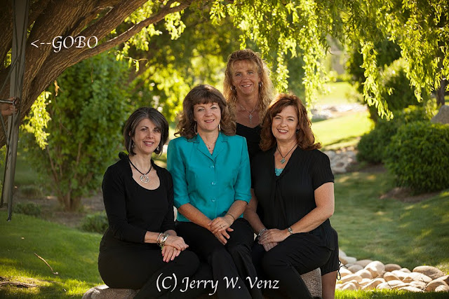
I learned, over 30 years ago, from Leon Kennamer—the Master Photographer that developed subtractive lighting for portraits—that there’s no need for reflectors or supplemental flash if you know how to control natural light with Gobos (Black Flats or flags as we called them in film making). The basic premise being: when you have the light it’s silly, and unnatural looking, to add light! Adding light tends to just create flat light that deletes shadows and without any shadows you lose the three dimensionality in your subject(s).

I’ll start with a worst case lighting scenario.  Here we have a nice little park with a couple of large weeping willow trees, but it’s 9AM and there’s intense light all around us. 
f6.3 @ 1/125 sec., ISO 400; Lens @ 142mm
  • The first step is to get them in the shade of that tree! I trimmed some of the tree’s hanging vines on the right leaving the vines on the left to help in the subtractive process.
  • Then we bring in our Gobo (a 42” Black Flat) to block as much light as we can from the left.
Here’s the scene without the Gobo….
No Gobo
As you can see this single Gobo is most effective on the people closest to it. The single Gobo is very effective for individual portraits where you can bring it in very close to the subject…

f4.5 @ 1/250 sec., Iso 400; Lens @ 185mm
Done at 9:11AM in the same spot as the group portrait you can see the natural looking, three dimensional, effect subtractive lighting creates.

NATURAL GOBOS:

My preferred method of subtractive lighting is to use Large Natural Gobos on locations I use regularly for group portraits. These natural Gobos can be a tree line, rocks, or large bushes to one side of the group.

The Key here is Subject Placement….

f6.3 @ 1/160 sec., ISO 400; Lens @ 105mm
Leon Kennamer taught that, “The Light is at the Edge of the Forrest ”. That means that you place your subject literally at the edge of the tree canopy, but still in the shade. That way we can get good Directional Light from a large patch of sky.

In the above portrait I’ve placed this group so that the tree line on Camera Left is my Gobo creating the Shadows on their faces while a large patch of blue sky on Camera Right is the Key Light.

This portrait was done 2-hours before sunset so that my backlit background is under control. Subtractive lighting is actually a very simple concept; its execution only requires that you be able to see the directional light and the shadows it creates when you have an effective GOBO.  

The concept here is fundamental in the traditional art world; Leonardo da Vince wrote…
The Artist who can make his subject appear to be in relivo (made to appear to have elevation, with depth and dimension) is he who should receive the greatest praise!

Go our and try it!  If you have questions don’t hesitate to ask…’Til next week.

Author: Jerry W. Venz, PPA Master Photographer, Craftsman
Training site: http://www.LightAtTheEdge.com
Client site: http://www.TheStorytellersUsa.com

Tuesday, October 9, 2018

FALL PHOTOGRAPHY TIPS FROM A PROFESSIONAL


First and foremost you’re NOT going to see any backed-off, wide-angle views, of a forrest of fall colors from me. I’ve always found those views pretty, but photographically boring. They’re what the amateurs do with their fixed lens point-n-shoot cameras—usually at the “scenic view” pull-out along side the road! 

I do what photography does best—narrow the view and reveal stunning detail. And, you do that with lenses leaning in the telephoto region of focal length.

That being said, lets move on to lighting.

Back-Lighting for intense detail…


f7.1 @ 1/800 sec., ISO 400; Lens @ 280mm
With this pair of small leaves 200mm was not enough so I installed my 1.4X extender on my 70-200mm f2.8 lens. The large lens hood with careful framing avoided flare (I HATE detail robbing flare!) in the intense backlight here.

Here I used backlighting for mood…

f7.1 @ 1/320 sec., ISO 400, Lens @ 98mm
With my lens at nearly 100mm I’m still only showing a part of this weeping willow tree; I rarely even photograph a whole single tree. In this image I wanted the juxtaposition of the hanging willow leaves over those interesting red bushes—that have lost their leaves.

Front Lighting can be Tricky….

f6.3 @ 1/800 sec., ISO 400; Lens @ 175mm

Direct Sun can easily ruin an image if you’re not very careful with your exposure. Those yellow leaves are prone to Clipping—blowing out your highlights—a loss of detail.

Two things made this image work:
  1. I did this at 5:04pm in November—the sun set at 5:20pm and I chose leaves that had Crossing Light from the left side. That directional light picked-up really nice detail.
  2. In Addition, I used my camera’s meter in Spot Mode—where I usually keep it—measuring the brightest surfaces of my subjects.
Or Front Lighting can be Easy…

f7.1 @ 1/160th sec., ISO 400; Lens @ 200mm
Top lighting here from an overcast sky is super easy to expose. It also creates nice soft colors. If the sun came out in this situation those wet leaves would have clipped like crazy. I cheated with this image and spritzed these leaves with my spray bottle mister until they dripped water—hey What can I say—it wasn’t raining when I needed wet leaves! Besides I don’t like doing photography in the rain.

Fall Colors in Flat Light…

 f8.0 @ 1/160th sec., ISO 800; Lens @ 150mm
This was done in full shade under this tree’s canopy. Since flat light can rob a scene of it’s contrast it’s important to pick a scene with lots of contrast. Here I had some great colors against that black tree trunk, which made these leaves glow with color. I did have to go to 800 ISO to capture this hand-held, but my Canon 5D MKII has no problem at that ISO.

I guess this proves that you can create great fall images in most lighting situations. You just have to pick subjects appropriate for the lighting and be careful with your exposures.

Well, ‘till next week…I’m here if you have questions….

Author:  Jerry W. Venz, PPA Master Photographer, Craftsman
Training Site: http://www.LightAtTheEdge.com
Client Site: http://www.TheStorytellersUsa.com

Tuesday, October 2, 2018

VARIATIONS ON A THEME; POST PROCESSING DIGITAL FILES


I’ve been revisiting my archives back to my early digital files, some as far back as 2000, when I got my first digital camera. What’s nice to see is that those old CD’s (Yes, CD’s!) can still be opened on our new computers and loaded into Photoshop!

I can open these old JPEGs in Camera Raw and do my favorite tweaks I do today with my new DSLR’s RAW files. After that I go to my favorite plug-ins for some artistic interpretations.

Here’s a finished artistic version of a file from 2003…


This image was form my second digital camera—the Fuji FinePix S-2 Pro, which produced jpegs at around 4.0 MB. Not much by todays standards, but we managed, with careful exposes, to produce some outstanding 30x40 images from our S2’s back then.

Black & White Processing Technique:

Step 1—NIK HDR Effects Pro 2 (Single Image Tone Mapping). Used Grannys Attic Preset with my modifications.

Step 2—NIK Silver Effects Pro 2—Used the Antique Plate 2 and modified it to my B&W taste.

Here’s the original file…


f13.0 @ 1/180 sec., ISO 400
This was an old hotel under renovation in Sacramento, California. I thought, with those ripped and tattered window shades, that it had the kind of creepy vibe that I could do something with.

Here’s the Color Interpretation….

I like this version mostly because of that red triangle in the second window (top left). It looks like a broken shard of glass.  I like the rust stains on the paint beneath the windows as well.

Color Processing Technique:

NIK HDR Effects Pro-2 (Single Image Tone Mapping).I used the Granny’s Attic Preset and tweaked it to my taste.

NOTE:  In addition to the obvious artistic changes to the original file a side benefit of processing an image in NIK’s HDR is that the size of the file is increased a lot.  With this image the original file was increased from 3.69MB to 6.06MBs.

However, I think that the Black and White rendition of this scene promotes the creepy vibe I imagined when I saw this building.  What do you guys think—the color or the Black and White?

’Til next week….

Author: Jerry W. Venz, PPA Master Photographer, Craftsman
Training Site:  http://www.LightAtTheEdge.com
Client Site: http://www.TheStorytellersUsa.com

Tuesday, September 25, 2018

OBSERVING AND WAITING FOR THE MOMENT IN PHOTOGRAPHY


While visiting with our sons in California this last summer we stayed with friends in route and they took us to Morrow Bay, on the Coast, for a marvelous seafood lunch. I had not been to Morro Bay in decades so, photographically it felt fresh—like I was seeing it for the first time. After lunch I suggested we drive out to Morro Rock so we could do a walk. I wanted to get out of the town and into the natural environment there at the coast; my camera beckoned me!

Parked near Morro Rock I knew that the huge landmark was not going to be a subject for me—it’s too big! Even being a hundred yards away it’s like a towering skyscraper dominating the landscape.  So, I put my 70-200mm lens on my camera and prepared to do what I do best (as I teach my students) and look for interesting slices of nature within the huge costal landscape.

While walking around Morro Rock looking back to the town the three huge stacks of the old Morro Bay Power Plant certainly dominated that landscape. That was not what I had in mind for a natural composition at the coast!

However, in the foreground this was what I saw happening in the ocean….

f10.0 @ 1/800 sec., ISO 400; Lens @ 102mm


This great scene was not just there waiting for me to show up—I hand to wait for it to develop. When I first walked up and put the viewfinder to my eye with my lens zoomed to its widest at 70mm this was the whole scene…


The Whole Ugly Scene; but look at that foreground!
Ten minutes later before the tour boat came into the bay the water was pretty smooth and the reflections of the smoke stacks were too literal a presentation for me. But, I loved that floating seaweed an the sea otter having his lunch was great as well.

So, I waited a bit and when I saw that boat approaching I thought that a boat that size should create a wake that would help me with this scene and the vision I had in my head.

That small wait really paid off.  Not only did I get some terrific ripples in the water, created by the boat’s wake, but the sea otter floated deeper into my frame and a bird landed in the water as well!

I just waited a few more seconds for that bird to paddle in-between the stacks before I started with the zoomed in image cropping out he top half of the whole scene.

I got what I wanted—a symbolic blending of nature and the abstract reflection of an abandoned man-made blight on the environment.

’Til next week…

Author: Jerry W. Venz, PPA Master Photographer, Craftsman
Training site: http://www.LightAtTheEdge.com
Client site: http://www.TheStorytellersUsa.com